Best Colors to Wear in a Lavender Field

When planning a photoshoot amidst cascading purple flowers, the choice of apparel plays a crucial role. The hues you pick can either amplify the breathtaking scenery or become lost in the majestic backdrop. This guide will navigate you through the art of selecting perfect garment shades that not only complement the surroundings but also highlight your presence exquisitely.
Imagine stepping into this enchanting realm. The aroma surrounds you, and the visual masterpiece stretches as far as the eye can see. Your attire should enhance this experience, creating an enviable photograph that speaks volumes. By understanding how different shades interact with the vibrant plants, you can orchestrate a visual harmony, making your moments in nature truly unforgettable.
Understanding the dynamics between your outfit and the natural elements involves more than just picking any garment. It’s about creating a fusion of elegance and nature, where every snapshot captures the essence of both the environment and your unique flair. Whether you’re leaning towards soft pastels or rich, bold tones, choosing wisely ensures that every memory captured in this picturesque scene turns out to be a masterpiece.
Complementary Shades to Enhance Lavender
When planning an outfit to visit a place filled with purple blooms, choosing harmonious tones can make a significant difference. By selecting hues that work well in tandem with the surroundings, you can create an aesthetically pleasing and visually captivating look.
One effective way to achieve this is by exploring the color wheel. Identifying hues that sit opposite purple can provide striking contrasts that accentuate the natural beauty. Additionally, analogous shades can also bring out the vibrancy of the surroundings, highlighting the softer undertones and creating a cohesive appearance. Below is a summary of some ideal hues and how they interact with the purple environment.
| Shade Category | Description |
|---|---|
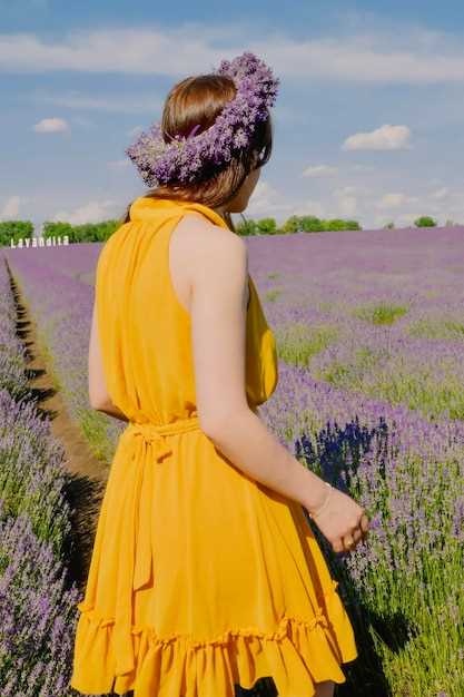
| Complementary | Yellow and gold tones create vibrant contrast, enhancing visual interest and making both colors pop. |
| Analogous | Pinks and blues offer a more harmonious interaction, creating a serene and cohesive look. |
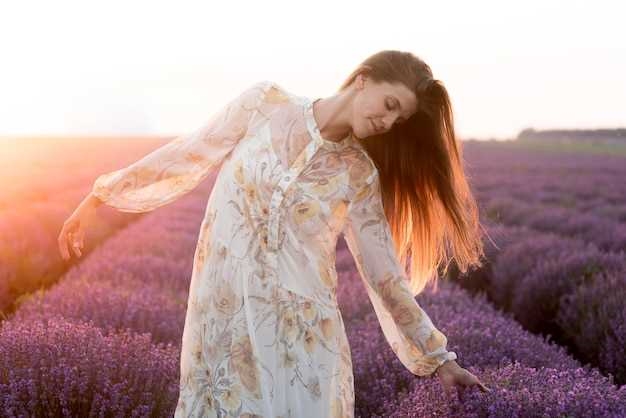
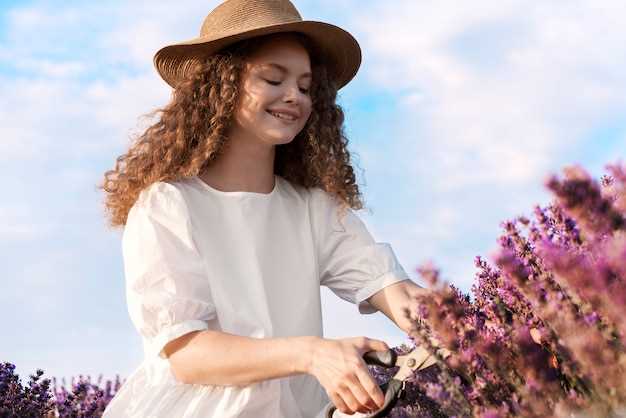
| Neutral | Whites, greys, and beiges maintain balance and let the surrounding purples stand out without overwhelming the eyes. |
| Earthy | Warm browns and greens provide a natural and rustic appeal, enhancing the organic scenery. |
Creating Contrast with Bold Tones
Elevate your visuals by experimenting with vibrant shades that effectively enhance the serene beauty of the purple landscape. By integrating striking hues, you can produce compelling visuals that pop against the calm surroundings, engaging the viewer and adding depth to your images.
Imagine how magentas, rich reds, and deep oranges can invigorate an otherwise tranquil setting. These dynamic shades not only draw attention but also create a harmonious balance, making the entire scene more captivating. Pairing bold choices with the environment showcases a perfect fusion of energy and tranquility, making your visual storytelling truly memorable.
When selecting outfits, consider textiles or accessories that boast these audacious shades. A vivid dress or a striking scarf can serve as a focal point, ensuring your presence stands out. It’s all about finding the right mix–intense color paired with the natural elegance around you can spellbindingly transform your aesthetic narrative.
Pastel Hues for a Soft Look
To achieve a delicate and serene aesthetic, incorporating a palette of light, soft tones can make a significant difference. These hues evoke a sense of tranquility and blend harmoniously with natural surroundings, resulting in an ethereal visual experience. The gentle shades have a unique way of highlighting your presence without overpowering the scenery.
| Shade | Emotion |
|---|---|
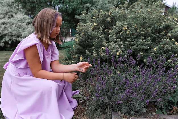
| Pale Pink | Romantic |
| Mint Green | Fresh |
| Baby Blue | Calm |
| Soft Peach | Warm |
| Light Lilac | Dreamy |
The key to utilizing these tones lies in their subtlety; they provide a gentle contrast to more vibrant elements, creating a balanced and visually appealing composition. By selecting garments in these calming shades, you can achieve a picturesque and cohesive look that emphasizes natural beauty and elegance.